The Palette Edit No. 01: Butter Yellow + Powder Blue + Cherry Red Décor
Updated: 6 days ago
The colour combination that shouldn't be this easy to live with — but absolutely is.

There are colour palettes that look fantastic on a tiny paint swatch and become mildly terrifying the second you imagine them covering an actual room.
This isn't one of them.
Butter yellow + powder blue + warm white + cherry red is cheerful without becoming childish, colourful without becoming chaotic, and interesting enough to rescue a room from the Land of Greige.
Welcome to The Palette Edit No. 01.
Disclosure: Some of the products featured in this post are affiliate links. If you decide to purchase through them, I may earn a small commission at no additional cost to you. Thank you for supporting My Iconic Finds ❤️
🎨 Meet the Palette

Our starting four:
🧈 Butter Yellow — soft, creamy and warm rather than lemon-bright
🩵 Powder Blue — clear and airy without becoming icy
🤍 Warm White — the breathing room that holds everything together
🍒 Cherry Red — saturated, confident and used sparingly
Don't become emotionally attached to the exact hex codes.
Paint, fabric, ceramic and wood all reflect colour differently, and natural light will change them throughout the day. Think of these as a guide to the relationship between the colours rather than four shades you must match with forensic precision.
The important part is:
soft yellow + clear pale blue + creamy white + one proper red.
Not mustard. Not navy. Not blush.
And definitely not four pastels having a tea party.
Why This Colour Combination Works
The magic here is the balance between warm and cool.
Powder blue brings freshness and calm. Butter yellow provides warmth. Warm white prevents either colour from taking over.
Then comes the little troublemaker: cherry red.
Without it, blue and yellow can become very sweet. Add one sharp red detail and suddenly the palette feels more contemporary, collected and deliberate.
Think of red as punctuation.
The room needs a comma, not an entire paragraph.
So no, you do not need a red sofa, red curtains, red rug and six red cushions.
One fabulous red lamp? Now we're talking.
The 50 / 25 / 15 / 10 Formula
If you're wondering how much of each colour to actually use, start roughly here:
🤍 50% Warm White
Walls, larger neutral upholstery, rugs, ceilings and visual breathing room.
🩵 25% Powder Blue
Your main colour moment: furniture, cabinetry, curtains, tile or a painted element.
🧈 15% Butter Yellow
Smaller furniture, textiles, lighting and decorative pieces.
🍒 10% Cherry Red
Small furniture, artwork, lamps, ceramics or individual accents.
This is not mathematics you need to perform with a calculator while standing in IKEA.
It's a hierarchy.
And you can absolutely shift the percentages depending on the room.
Love the combination already?
How to Use Butter Yellow + Powder Blue Around your Home
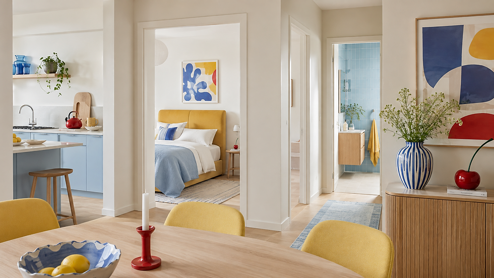
Here's where the fun starts.
The goal isn't to reproduce exactly the same colour formula in every room. Instead, we'll let a different colour take the lead depending on the space.
🛋️ Living Room: Let Blue Be the Hero

The living room is probably the easiest place to start because you can introduce plenty of colour without touching the walls.
For a confident version, try:
warm-white walls
powder-blue sofa
one or two butter-yellow cushions
natural timber furniture
one small cherry-red lamp, side table or decorative object
A powder-blue sofa would be my hero move.
It's colourful enough to make the room memorable while still being surprisingly easy to decorate around.
If committing your largest piece of furniture to blue makes you slightly nervous, keep the sofa cream and introduce powder blue through an armchair, curtains or painted cabinet instead.
🛒 Shop This Room
🛏️ Bedroom: Let Yellow Take the Lead

Rather than repeating the blue-heavy living room, I'd reverse things here.
🛒 Shop This Room
It feels sunny without becoming loud.
You could also keep the entire bed neutral and use butter-yellow curtains against very pale blue walls.
Very good. Just keep the blue genuinely soft and airy.
We're creating sunny Saturday morning, not IKEA children's department circa 2004.
Not ready for a yellow headboard?
A butter-yellow throw/cushion gives you the same warmth without the commitment.

🛒 Shop This Room
🍳 Kitchen: Make Powder Blue Architectural

Here's where powder blue can stop being an accessory.
Powder-blue cabinetry + creamy stone + warm wood is a gorgeous combination.
You don't necessarily need an entirely blue kitchen either.
Consider using it on:
lower cabinets
the island
a freestanding pantry
one bank of tall cabinetry
a painted dresser
Keep the larger surrounding surfaces quiet with warm white and creamy stone.
Then bring yellow and red into the things that can easily change.
A butter-yellow pendant, ceramic bowl or counter stool adds warmth. One small red object gives the room that unexpected little kick.
🛒 Shop This Room
🛁 Bathroom: Start With Blue Tile
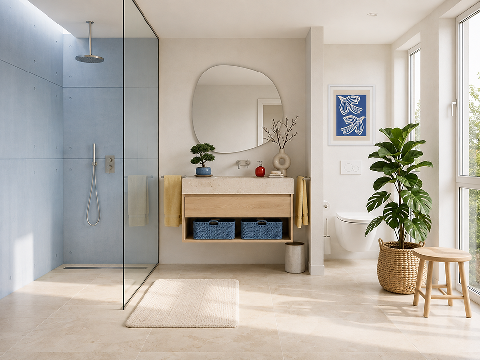
This palette makes a brilliant bathroom because the blue already feels natural in the space, while yellow prevents it from becoming cold.
Try:
powder-blue handmade-look shower tile
warm-white walls
creamy floor
timber vanity
butter-yellow towels
one tiny red accessory
And yes, the red could literally be a soap dispenser.
That's enough.
Bathrooms are small. Colours occupy more of your visual field, so restraint matters.
Also, please resist the temptation to add nautical stripes, anchors, rope baskets and a sign saying RELAX.
🛒 Shop This Room
🍽️ Dining Room: Get Braver

Dining rooms are fantastic places to experiment because they don't need to feel quite as restful as bedrooms.
This is where I'd consider butter-yellow furniture if you find sophisticated ones.
For example:
warm-white walls
simple timber dining table
butter-yellow dining chairs
powder-blue cabinet or sideboard
large artwork containing blue with a little red
cherry-red candleholders or one red pendant
Or reverse it:
Powder-blue walls + timber table + cream chairs + one fabulous butter-yellow pendant.
Because the palette is already doing the interesting work, keep the furniture shapes relatively uncomplicated.
🛒 Shop This Room
yellow dining chairs or yellow cushions
🚪 Entryway: Go for the Unexpected

An entryway is the perfect place to push the palette further. Why?
Because you don't sit in your hallway staring at it for six hours.
You pass through it, so there's no reason why you can't give it some personality.
Try powder-blue walls with a butter-yellow console and one red detail.
Or keep the walls white and introduce a powder-blue storage cabinet with a red table lamp above it.
Entryways are excellent testing grounds for colour combinations you're not quite ready to unleash on the rest of the house.
🛒 Shop This Room
The Materials That Make It Look Grown-Up
Colour is only half of the equation.
The materials around it are what stop this combination feeling juvenile.
I particularly like:
Pale oak — light, relaxed and contemporary
Walnut — adds sophistication and contrast
Chrome or brushed nickel — keeps everything fresh
Creamy limestone — beautiful with both yellow and blue
Linen — softens the colour
Wool — adds depth and texture
Coloured glass — brilliant for those small blue or red moments
If the palette is feeling too sweet, don't immediately remove the colour.
Add a grown-up material instead.
Walnut, stone or chrome can completely change how those same colours read.
What I Would NOT Pair With It
A few things can send this palette in the wrong direction.
❌ Too much cool grey
It muddies a combination that works best when it feels clear and fresh.
❌ Five more pastel colours
We've already got two soft colours.
We do not also require mint, lavender, peach and baby pink.
The room isn't collecting Pokémon.
❌ Orange-toned timber everywhere
Yellow + very orange wood can push the whole room too warm. Pale oak, natural oak and walnut are easier.
❌ Beige everything
Warm white is already doing the neutral work.
If the walls, rug, sofa, curtains and furniture are all beige, we've somehow managed to turn a colour article back into a beige room.
Impressive, but no.
Three Ways to Try It
You absolutely do not need to redecorate an entire room.
Choose your level of commitment.
🟢 SAFE: “I Like Colour, But Let's Not Get Carried Away”
Keep your existing neutral room and add:
powder-blue cushions
butter-yellow throw
colourful artwork
one small red object
Nothing expensive. Nothing permanent.
If you hate it in six months, congratulations: you own a different cushion.
🟡 CONFIDENT: “Okay, I See It Now”
Choose one substantial coloured element:
powder-blue armchair
blue curtains
yellow headboard
blue cabinet
yellow dining chairs
Then introduce the other colours more quietly.
This is probably the sweet spot for most homes.
🔴 GO FOR IT: “Paint Is Cheaper Than Therapy”
Make colour architectural.
Think:
powder-blue kitchen
blue-tiled bathroom
butter-yellow cabinetry
pale-blue bedroom walls
Then use warm white for breathing room and cherry red as the final little jolt.
Bold doesn't have to mean chaotic.
In fact, the more confidently you use one colour, the less random colourful stuff you usually need around it.
Six Mistakes That Can Ruin the Look
Before we go shopping, a quick intervention.
1. Making everything pastel
The red needs to be properly red. That's what creates tension.
2. Giving every colour equal space
Choose a dominant colour, a supporting colour and an accent.
3. Choosing an acidic yellow
Look for creamy, buttery yellows rather than neon lemon.
4. Choosing a blue that's basically grey
We want an actual blue.
Soft? Yes.
Sad? No.
5. Matching everything
You do not need yellow-blue-red artwork above a yellow-blue-red cushion sitting on a yellow-blue-red rug.
6. Forgetting texture
Linen, timber, wool, stone, glass and metal give simple colours depth.
🛒 Shop the Butter + Blue Edit
🩵 Bring in the Blue
🧈 Add the Butter
🍒 Add One Little Hit of Red
🤍 Ground the Room
pale-oak/walnut accessories
🛒 I've collected the furniture, textiles, lighting and little finishing touches I'd actually use with this palette in one place.
🦌 Elafina says:
If you're saving anything from this article, make it this:
🤍 Warm white: the foundation
🩵 Powder blue: the main colour
🧈 Butter yellow: the warmth
🍒 Cherry red: the surprise
Best woods: pale oak + walnut
Best metals: chrome + brushed nickel
Best textures: linen + wool + stone + coloured glass
Avoid: cool grey, too many pastels and excessive matching
The important thing is to create a clear hierarchy.
Let one colour lead. Let another support it. Give the room plenty of breathing space.
Then add that slightly unexpected little flash of red.
🎨 The Palette Edit
This is No. 01 in The Palette Edit — a My Iconic Finds series dedicated to colour combinations worth actually decorating with.
Coming Soon: The Palette Edit No. 02 — Burgundy + Blush + Cream + Walnut
Because apparently we're not frightened of colour anymore.


Comments